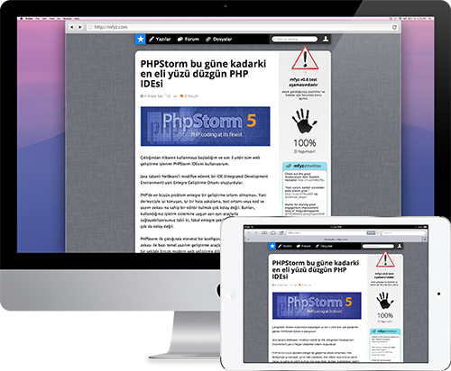
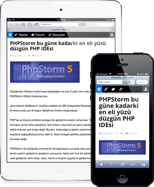
I’ve put my efforts on making mfyz.com responsive and mobile compatible last week. After 4 days work, now you are able to access mfyz.com from your tablets and phones (small screen devices).
I’ll write about coding responsive layouts following weeks. There are lots of CSS frameworks that allows you to build responsive layouts but I didn’t use any CSS frameworks when I coded current interface. I could transition to twitter bootstrap but I didn’t see any need to do so. Also the current layout is simple enough to not require any complex structure. Anyway, let’s get back to the subject.

Desktop version (as you can see above) is displayed for 800px and wider screen resolutions. For smaller screens than 800px, interface turns to mobile compatible fluid layout. As you know, fluid layouts are resolution independent because they are fitting the screen they’re in. That’s the reason most of the mobile compatible pages built in fluid layouts.
Tablet devices are usually 800px and wider when they are held landscape, so you will see mfyz.com’s desktop version for landscape orientation on most of the tablets.
Also, most of the tablets have below 800px wide screen resolution for portrait orientation, so the site becomes fluid and mobile compatible version. The mobile compatible version is optimized for better readability and optimized navigation.

Related Posts
- 1 min readRemove unused CSS with PurgeCSS
- 1 min readA Beginner's Guide to HTML & CSS
- 3 min readPico CSS: The Anti-Tailwind Framework I Actually Enjoy
- 5 min readAll You Need Is Markdown and JSON
- 4 min readI Became Obsessed With Dependency-Free, Vanilla Apps
- 6 min readI Tested Three Node.js Excel Libraries So You Don't Have To
Share