I recently talked a lot about the importance of collaborative and smarter documentation that will improve your personal and professional workflow. Certainly, it will be different than other competitors in an interesting use case I found myself in one of the hobby projects that I used Airtable as a remote database tool all of the sudden.
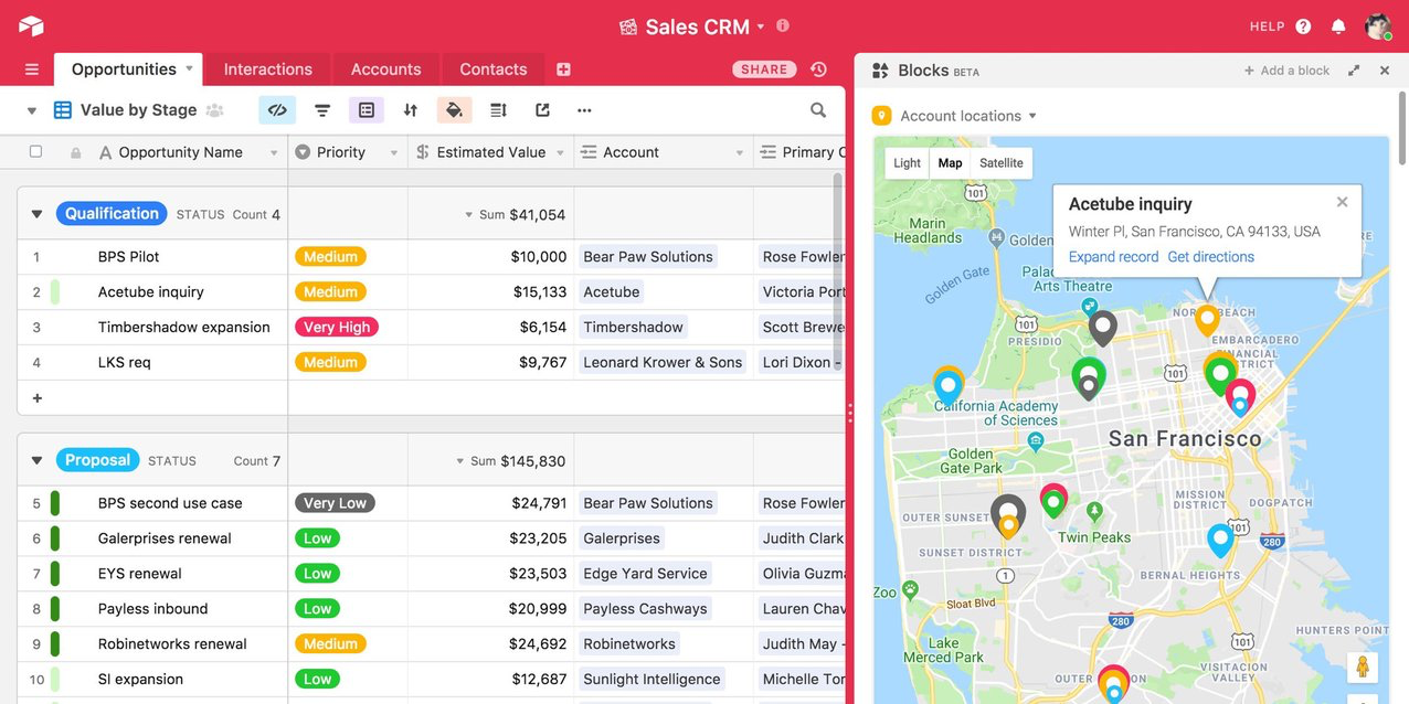
Airtable is a very nice mobile-friendly document management in a “spreadsheet” style base. You can create your data structure in any data table model. You can create different views for your data (in calendar view, or filtered table view, or kanban view…).

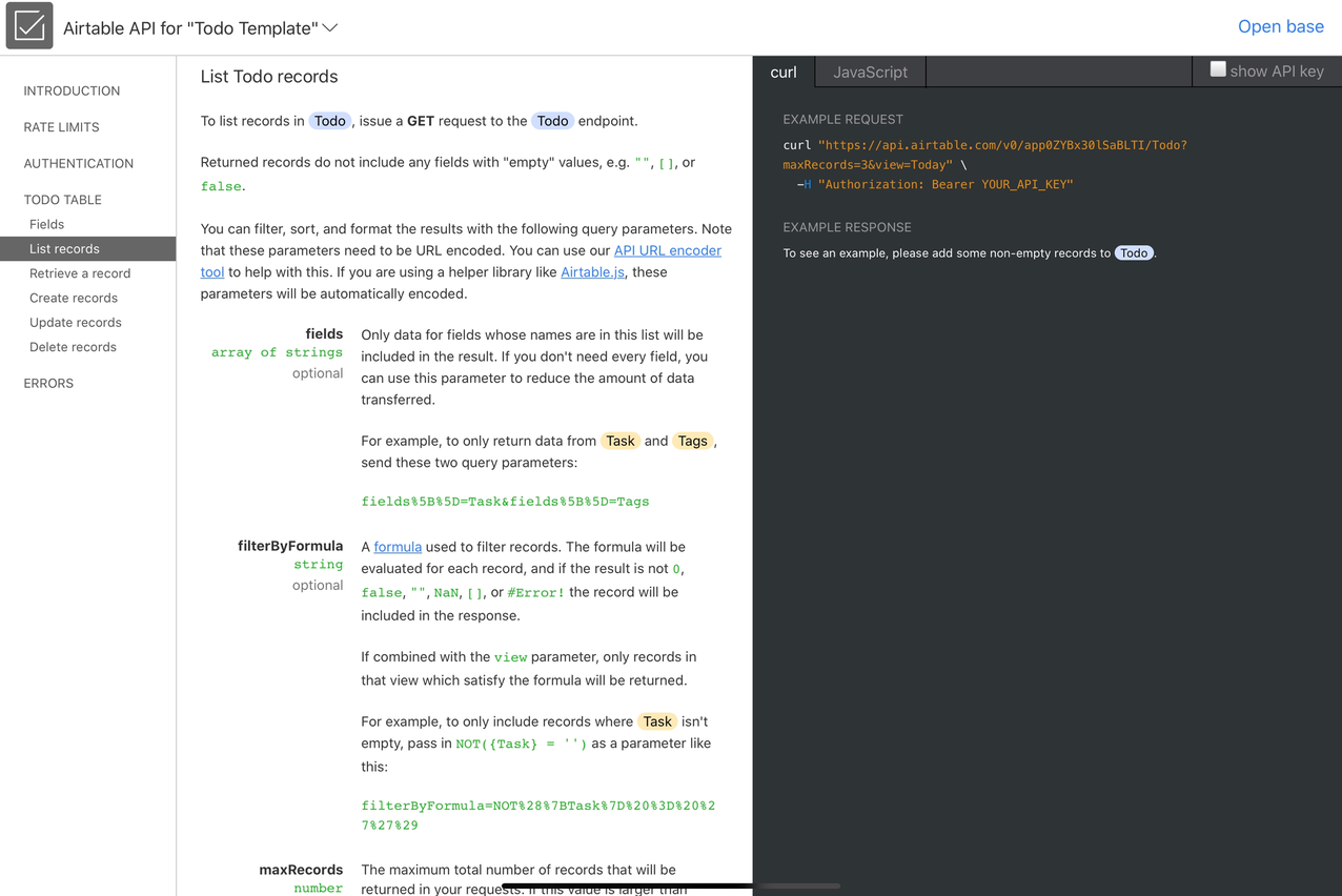
What makes Airtable special for me is its API. Their API is so easy to get started and access, because you get your data-specific API documentation after you login. It shows your data in API example right and there in the dynamic documentation.

Airtable API essentially makes Airtable that can be used as a remote database for small or personal projects. Managing your data belongs to Airtable’s clean and nice web or mobile interface, and you implement your data in any format you like on any platform.
If you are needing read-only access, implementing Airtable API can be a matter of minutes since the documentation gives access to your data very quickly. You only need to convert the curl request to your favorite platform’s HTTP request. If you are needing a javascript version, it also produces NodeJS example code that you can drop in and start using your data.

Write access is also not very different than read-only. Your data model will be well be documented in the dynamic API documentation for your table. You only need to start constructing your API requests and make the call…
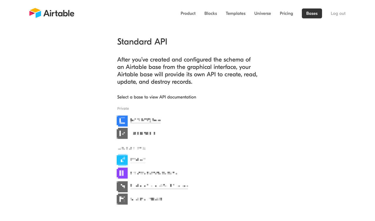
If you haven’t created an Airtable account and played with it, definitely do so: https://airtable.com/ and check out their auto-generated documentation here: https://airtable.com/api (after you login to your account).

